Bad Pictograms I
Pictograms are fascinating images. Their purpose is to communicate as much as possible with the greatest economy of expression; they are designed to achieve both maximum comprehension and inclusivity.
Some pictograms are gender-specific – we all know this one:

The Replacements might lament the abidingly binary sartorial signifiers – either outdated or always-already ethnocentric or simplistic – but they remain, oddly perhaps, internationally recognizable.
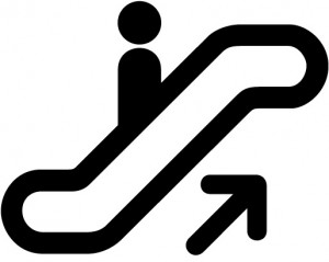
More often, they operate with a default male figure (or, I suppose, a fairly androgynous figure in non-gendered clothing) representing a person. This pictogram, for instance

is not designed to illustrate a man going up an escalator, but a person. And this woodgatherer similarly could be either male or female (or both):

Such standard pictograms are already weird enough as objects of study. Think about what they reveal to be unnecessary attributes of the human form: hands, feet, eyes, ears, noses. And necks. Animals are trickier to represent with similar abstraction – I’ll write about this in a later post. But when it comes to ourselves, it seems that we’re pretty good at recognizing an image of our own species even in its most stripped-down form (at least for men. Women evidently need skirts). I suspect there aren’t many people who look at that escalator pictograph and think: “Look at that, a pawn sliding up a ramp.” Or at the woodgathering one, thinking “Aww, a monkey picking up twigs.”
Pictograms work on a principle of maximum reduction and minimal specificity: the figure depicted ought to represent as many individually distinct viewers as possible. It should address itself to everyone concerned.
That’s the idea, anyway – and that’s why the above are “good” pictograms. There are plenty of “bad” pictograms, or ones that are described as bad by people around the interwebs. Like these:

I actually think those are pretty fantastic, even if I don’t understand all of them. The enormous anal suppository is one of the funniest and most frightening images I’ve seen in a while. But by and large, they communicate their point effectively – and they don’t exclude any members of their audiences. Pill, tongue, mouth, ear, hand, bum, inhaler, face: those are all fairly universal signifiers and depicted with a great degree of abstraction.
Here’s an actual bad pictogram. It’s from my neighbourhood, and my current favourite:
With the caption, it’s clear what it’s supposed to say. But consider it without text:
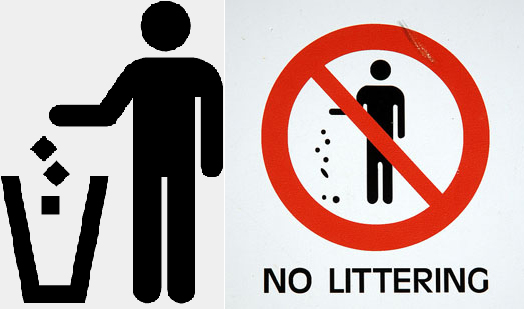
What is this man doing? And what would the sign prohibit? Standing with a bag? Holding a bag while being unstylish and middle-aged? And it’s not just the lack of clarity that makes this a hilariously inadequate pictogram. It’s the lack of abstraction. Compare these more widely used signs designed to convey a similar message:

The first encourages all of us to dump three cubes into a cone. The second tells all of us not to drop coins and an enormous lozenge on the ground. While the actions may thus be a little less than unequivocally clear, the person performing them is universal in appeal: if you’re a biped (at least in principle), have two arms (at least in principle), and a floating head, you know this is meant to be you.
Now go back to my neighbourhood sign.
 Who is this guy? He’s wearing baggy trousers and tucks his shirt in. Facial features dominated by a receding chin and a prominent nose are topped by what looks like pretty bad accountant hair, thinning at the back. Overall, he doesn’t appear to be in particularly good health: his clothes hang off his emaciated and atrophied frame and he’s got a humpback in the works.
Now, to be fair, this is a neighbourhood full of academics. The figure probably represents a good number of people around here quite aptly. So if you’re an associate professor of statistics in your early forties, wandering around the Annex with your saggy polo shirt tucked into the slightly snug waistband of your well-worn Dockers, overstuffed garbage bag in hand, just looking for a place to litter, this sign will tell you in no uncertain terms, sir, to go drop your trash elsewhere. If, however, you’re a female grad student in a flowing skirt or an ageing corpulent scot in a Macdonald clan kilt trying to get rid of your waste, come on in: this private property is your oyster.
And that’s why I love that sign. Next: dogs.
- Click to email a link to a friend (Opens in new window)
- Click to print (Opens in new window)
- Click to share on Facebook (Opens in new window)
- Click to share on Twitter (Opens in new window)
- Click to share on Tumblr (Opens in new window)
- Click to share on LinkedIn (Opens in new window)
- Click to share on Reddit (Opens in new window)
- Click to share on Pinterest (Opens in new window)
4 Responses to Bad Pictograms I
Leave a Reply Cancel reply
Recent Comments
- Premodern Performance-based Research: A Partial Bibliography – Alabama Shakespeare Project on My Trouble with Practice-as-Research
- Premodern Performance-based Research: A Partial Bibliography – Alabama Shakespeare Project on Where is the Theatre in Original Practice?
- Alex on Steven Moffat, Sherlock, and Neo-Victorian Sexism
- Tim Keenan on Where is the Theatre in Original Practice?
- Holger Syme on 1920s Berlin Theatre: Research Marginalia 1
Archives
- November 2021
- April 2020
- March 2020
- October 2019
- January 2019
- December 2018
- November 2018
- October 2018
- March 2018
- February 2018
- January 2018
- July 2017
- May 2017
- March 2017
- November 2016
- October 2016
- September 2016
- August 2016
- June 2016
- May 2016
- January 2016
- December 2015
- November 2015
- October 2015
- September 2015
- August 2015
- July 2015
- June 2015
- May 2015
- February 2015
- January 2015
- November 2014
- October 2014
- September 2014
- August 2014
- July 2014
- May 2014
- April 2014
- March 2014
- February 2014
- January 2014
- November 2013
- October 2013
- September 2013
- August 2013
- July 2013
- May 2013
- April 2013
- March 2013
- January 2013
- December 2012
- November 2012
- October 2012
- September 2012
- August 2012
- July 2012
- April 2012
- March 2012
- February 2012
- January 2012
- December 2011
- November 2011
- October 2011
- September 2011
- August 2011
- July 2011
- June 2011
- May 2011
Copyright

Holger Syme's work is licensed under a Creative Commons Attribution-NonCommercial 3.0 Unported License.Images may be reused as long as their source is properly attributed in accordance with the Creative Commons License detailed above. Many of the photos here were taken at the Folger Shakespeare Library; please consult their policy on digital images as well.


I’m a Graphic Artist/Sign Painter, and I’m most concerned about the mans feet (or lack of) and that one wild toe sticking out.
Lovely stuff, Holger, truly a pleasure to read.
Oh yes, the more abstract ones are almost literally universal. Quite a few of them are subject to ISO standards. As for my neighbourhood sign – it’s a puzzle. It belongs to a school, and there are three or four of them, but they do look like some kind of collage: if you look closely, you can see that the bag and the hand have been pasted together. If it is, though, I’d love to know the story there: where did the two elements come from? Is the man part of a hand-shake diptych, and what happened to his now orphaned friend?
I wonder where the owner got the sign: does Home Hardware do a line of enameled metal signs? Walmart? Rona? Does the owner’s cousin own a print shop?
The clear, abstract ones you cite are actually pretty universal, while this one looks like it was made up by someone with a bootleg copy of Photoshop.